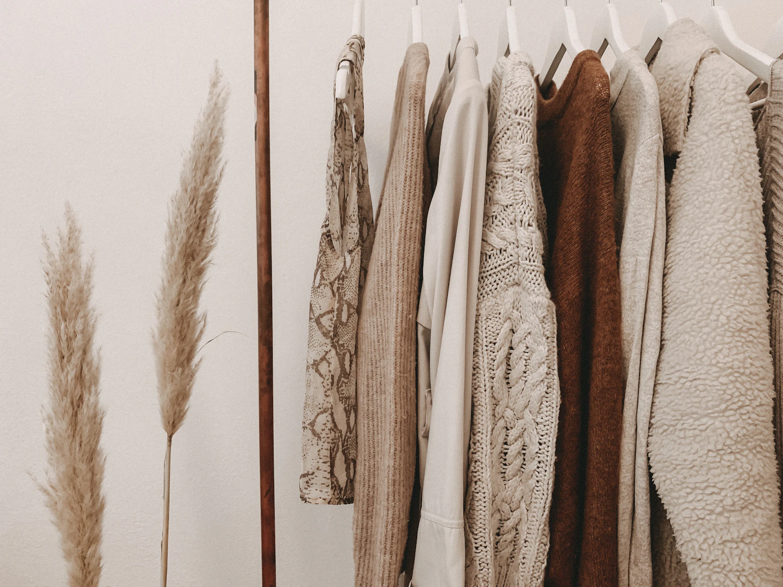
Every one of these fabrics catches light differently. Your prompt has to know that before the model can show it.
Every one of these fabrics catches light differently. Your prompt has to know that before the model can show it.
Silk, lace, denim, and satin that read as cloth instead of a smooth colored shell
You have seen the giveaway even if you never named it. The face is gorgeous, the lighting is moody and correct, and then your eye drops to the sweater and something dies. The knit has no stitches. The denim has no weave. The dress hugs every curve like it was airbrushed on, with no seam, no pull, no wrinkle where a body would make cloth wrinkle. The person looks real. The clothes look rendered.
Fabric is one of the quiet skill gaps in AI art, and it stays a gap because most prompts describe clothing by garment name and color and stop there. "Red dress" tells the model shape and hue. It says nothing about what the dress is made of, and material is the whole game. Cloth is structure plus weight plus the way light hits the surface, and each of those is promptable once you know the words.
So today is a wardrobe deep-dive: how the main fabric families actually behave, the vocabulary that summons them, and the rescue moves for when the lace melts anyway.
The model paints pixels that resemble its training images, and in millions of those images, clothing is smooth, compressed by JPEG artifacts, or blurred by depth of field. Left unguided, the model averages all of that into a soft, texture-free shell in the right color and silhouette. It is not failing. It is doing exactly what "red dress" asked for, at the lowest level of detail that satisfies the request.
Real cloth has three properties the average prompt never mentions. First, structure: fabric is built from thread, so it has a weave or knit with a direction and a scale, visible up close as actual texture. Second, weight: heavy wool falls in big slow folds, chiffon floats and catches air, denim creases at stress points and holds the crease. Third, response to light: satin throws hard bright highlights, velvet swallows light and glows at the edges, cotton sits matte in between. Name those three things and the garment starts existing in the scene instead of hovering on top of it.
Shiny fabrics live and die on their highlights. Satin's signature is a long, soft-edged bright band that follows the folds, bright where the surface faces the light, falling off fast into rich mid-tones. Prompt the material and the behavior together: "emerald satin slip dress, glossy sheen, soft specular highlights along the folds, fluid drape." If the result looks like colored plastic, the highlights are too hard and too white; pull back the gloss language and add "soft sheen" or "subtle luster." Silk charmeuse reads similar but lighter, with smaller, livelier folds.
Lace is the hardest common fabric for a diffusion model because it is a fine repeating pattern with holes in it, and models blur repeating fine structure into mush, especially at a distance. Give it help: "scalloped floral lace, fine openwork detail, sheer against the skin" works far better than the word "lace" alone, and lace at portrait distance will always beat lace in a full-body shot. If the pattern still smears, generate at a higher resolution or crop tighter. The model needs enough pixels per motif for the pattern to survive.
Real denim is a twill, which means the weave runs in fine diagonal lines, and it fades where it rubs: thighs, knees, seams, pocket edges. "Faded indigo denim jacket, visible twill weave, worn seams, contrast stitching" gets you a garment with history. Denim also holds structure, so it should stand slightly away from the body at the collar and cuffs rather than shrink-wrapping the figure.
A sweater with no visible stitches is the classic painted-on giveaway. Ask for the construction: "chunky cable-knit sweater, visible ribbed cuffs, soft wool texture" or "fine-gauge ribbed knit." Chunky knits are forgiving because the stitch pattern is large enough for the model to render cleanly. Fine knits behave more like jersey: mostly smooth, with ribbing visible at cuffs, collar, and hem, which is exactly where you should let it show.
Translucent fabrics are really a layering effect: skin tone and background showing through, edges catching light, folds stacking into deeper opacity. "Sheer chiffon overlay, translucent layers, fabric catching the breeze" gives the model the physics. Sheers are also your best friend for motion, because they exaggerate air and movement in a way heavy fabrics cannot.
| Fabric | Light behavior | Drape | Prompt anchors |
|---|---|---|---|
| Satin / silk | Long soft specular bands | Fluid, heavy pooling folds | glossy sheen, specular highlights, fluid drape |
| Lace | Matte, light passes through holes | Light, follows the layer beneath | scalloped floral lace, fine openwork, sheer |
| Denim | Matte with worn fading | Stiff, holds creases | twill weave, faded indigo, worn seams |
| Cable knit | Soft, shadowed stitch relief | Thick, rounded folds | chunky cable knit, ribbed cuffs, wool texture |
| Velvet | Absorbs light, bright rim edges | Heavy, soft folds | crushed velvet, deep pile, edge glow |
| Chiffon | Translucent, edge highlights | Floats, layers stack opacity | sheer overlay, translucent layers, airy |
Texture is only half the sell. The garment also has to obey the same physics as everything else in your image. A satin dress under the soft window light from our lighting guide should show gentle, wide highlights, while the same dress in hard club light throws narrow hot streaks. Fabric should wrinkle where the pose bends it, which is why it pays to build poses deliberately, the way we covered in the posing and body language guide: a raised arm pulls fabric tight across the shoulder, a seated pose stacks folds at the hips. When clothing shows zero stress anywhere, the painted-on effect returns no matter how good the weave looks.
The two-word upgrade: whatever the garment, add its weight and its surface. "Heavy wool coat, matte" or "lightweight silk blouse, soft sheen." Weight drives the folds, surface drives the highlights, and those two cues do more for realism than any quality tag you can stack.
Sometimes the render is 90 percent there: perfect face, perfect light, and one sleeve where the lace turned to porridge. Do not reroll the whole image. This is precisely the surgical case for inpainting: mask the failed area, prompt just the material ("fine scalloped lace, detailed openwork"), and let the model repaint the patch with all of its attention on one texture. For a garment that is intact but flat, a light img2img pass at low denoising strength with the fabric vocabulary added will sharpen weave and folds without touching your composition. Texture is exactly the kind of detail that low-denoise passes are best at enriching.
Fabric is a learnable skill, and it compounds. Once weave, weight, and sheen are in your standard vocabulary, every character you make gets a wardrobe that belongs to the physical world, and viewers stop being able to say why the image feels real. They just feel it. That is the entire craft in one sentence: realism is a hundred small agreements with physics, and clothing is a hundred of them wearing one zipper.